Use CSS Grid layout to transform a Stack to a Flag object
It’s a website layout that adapts to different screen sizes.
What is it
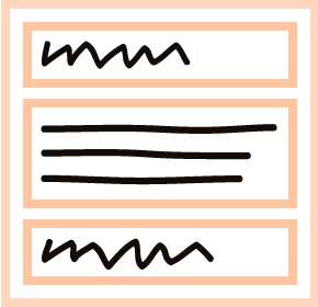
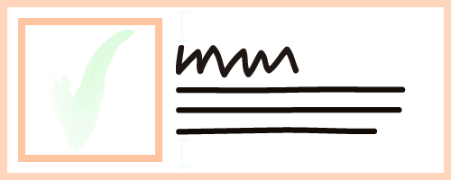
It’s a layout for a component on your website that transforms from a vertical stack to a flag object with re-ordered content (and vice-versa) depending on the screen size.
Play the video to see how it transforms.
Key points
- For a device with a narrow screen (i.e. your phone) the title, photo, and text are stacked vertically in one column.
- When the screen is wide enough the layout changes to two columns. The title and text go in the left column, and the photo goes in the right column.
- In the two column layout, the title and text stick together. Content in each column is centered vertically depending on which side is tallest.
What are Stack and Flag objects
A (vertical) Stack is when things are all stacked up one after another.

A Flag object (in CSS) is when the things are side by side and centered vertically.

Coding it
Example HTML
<div class="component">

  <div class="component__title">
    This is the title
  </div>

  <div class="component__image">
    <image src="placeholder-image-6_800x600.png" width="800" height="600" alt="" />
  </div>

  <div class="component__text">
    <p>
      The text goes here.
    </p><p>
      There is more text that goes here.
    </p>
  </div>


</div>
Example CSS
/* In a stack */
.component {
  background: WhiteSmoke;
  padding: 1rem;
}

.component__title {
  background: LightCoral;
  font-size: 1.2rem;
  font-weight: 700;
  padding: 1rem;
}

.component__image {
  background: PeachPuff;
  padding: 1rem;
}

.component__text {
  background: Pink;
  padding: 1rem;
}

@media all and (min-width: 600px) {

  /* Turn into a flag object */
  .component {
    display: grid;
    grid-template-columns: 1fr 1fr;
    align-items: center;
    column-gap: 0;
    row-gap: 0;
  }

  .component__image {
    grid-row: span 2;
    align-self: center;
  }

  .component__title {
    align-self: end;
    margin-top: auto;
  }

  .component__text {
    align-self: start;
    margin-bottom: auto;
  }

}
Key things in the CSS
For the Flag object:
grid-row: span 2on.component__imageto make it span the two rows of the title and text.align-self: endandmargin-top: autoon.component__titleto send the title to the bottom of its row.align-self: startandmargin-bottom: autoon.component__textto align the text to the top of its row.
But why though
Because in the layout on your website you want to show the title first when it’s being viewed on a phone, because the title is descriptive and the photo is more like decoration, and this makes it easier for users to scan the content on the page while scrolling.
And then, when the screen is wide enough, the flag layout looks better than a stack and it can adapt automatically based on the screen size and how much text there is to go with the heading.
Actual example
I used a modified version of the Stack to Flag layout on the Beijing Hikers website. (2022/11)
Notes
You can kind of make it work with flex instead of grid, but to make the vertical centering work you have to set a height or min-height on the flex container.
References
- CSS Grid Reference (MDN)
- A Complete Guide to Grid (CSS Tricks)
- The Flag object (CSS Wizardry [2013!])
