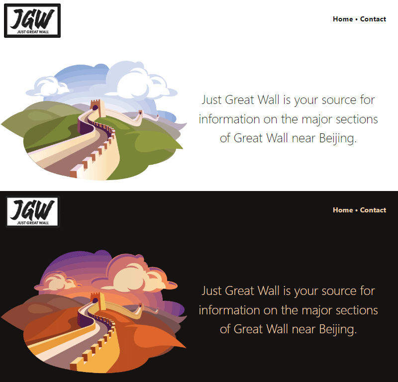
Use CSS to switch a hero image for a dark mode design
Basic explainer of how to use CSS to change an image if “dark mode” is requested.
TL;DR: Add an override inside a @media (prefers-color-scheme: dark) block to switch a background image to one that matches your dark mode colour scheme.
For e.g.
Light mode CSS
.hero-image {
   background-image: url('light-mode-bg.png');
}
Dark mode CSS
@media (prefers-color-scheme: dark) {
  .hero-image {
     background-image: url('dark-mode-bg.png');
  }
}
Use case
You have a website.
The home page has a hero image, as is traditional.
Your website has a special colour theme for dark mode.
You want the change the hero image to match the colour theme when it’s in dark mode.
You want to do this with CSS only, no Javascript.
Sample implementation

HTML
<section class="hero-image">

  <div class="hero-image--text">
    <p>
    Just Great Wall is your source for information on
    the major sections of Great Wall near Beijing.
    </p>
  </div>

  <div class="hero-image--img">
    <!-- Hi I hold a background image -->
  </div>

<section>
Notes on the HTML
- The hero image is wrapped in a
sectiontag. - Inside that is one
divfor the text and onedivfor the actual hero image. - The image itself is set as a background on
div.hero-image--imgso we can switch it using only CSS. - Text comes first in the HTML “for SEO”.
- All rather standard.
CSS
.hero-image {
  --block-padding: 3rem;

  /* Flex stuff [0] */
  align-items: center;
  display: flex;
  flex-direction: row-reverse;
  flex-wrap: none;
  justify-content: center;

  /* Regular stuff */
  padding-left: var(--block-padding);
  padding-right: var(--block-padding);
  margin-left: auto;
  margin-right: auto;
}


.hero-image--text {
  --block-padding: 2rem;
  flex: 1; /* [1] */
  font-size: 1.6rem;
  font-weight: 200;
  line-height: 1.5;
  padding-left: var(--block-padding);
  padding-right: var(--block-padding);
  text-align: center;
}

.hero-image--img {
  flex: 1; /* [1] */
  background-image: url('https://justgreatwall.com/assets/GreatWall-day-comp_612x406.png');
  background-position: center;
  background-repeat: no-repeat;
  background-size: contain; /* [3] */
  padding-top: 66.34%; /* This is the aspect ratio for the 612x406 image [2] */
}

/* Switch the background image for dark mode [4] */
@media (prefers-color-scheme: dark) {
  .hero-image--img {
    background-image: url('https://justgreatwall.com/assets/GreatWall-night-comp_612x406.png');
  }
}
Notes on the CSS
- [0] Flexbox is used to make the two
divs into equal-height columns and to re-order the content so the image goes on the left side. (ref. MDN: Flexbox, CSS Tricks: Flexbox layout guide) - [1] Both
divs haveflex: 1applied so the empty.hero-image--imgdivgets the same amount of horizontal space as the.hero-image--textdiv. - [2] The background image
divhas top padding that increases its height to match the aspect ratio of the hero image based on the horizontal space allocated by [1], even if the accompanying text in the other column only takes up one line. (Otherwise, if the text is only one line then the image shrinks down to the height of that one line.) - [3]
background-size: containis used to “scale the image as large as possible within its container without cropping or stretching the image.” (ref. MDN: background-size) - [4] The source of the background image is changed if
prefers-color-scheme: darkis requested by the user. (ref. MDN: prefers-color-scheme)
Actual implementation
Take a look at justgreatwall.com?
Notes on actual implementation
- The actual implementation includes a different layout for mobile browsers. For mobile it’s a stacked layout. The layout turns into columns when it’s wide enough to look okay in columns.
- No other notes, really.

Other notes
How to activate dark mode in your browser Dev Tools? (because I always forget.)
- Chrome/Chromium browsers: F12 to open Dev Tools, Ctrl+Shift+P to open the Run dialogue, start typing emulate and find the option Emulate CSS prefers-color-scheme: dark.
- Firefox: F12 to open Dev Tools, and in the Filter Styles section there are sun and moon icons to toggle light and dark mode. (This only works if privacy.resistFingerprinting is set to false in Firefox about:config.)
- Safari/iOS: no idea, sorry!
Sponsor-presented message:
This post is brought to you by Just Great Wall, your (eventual) best source for information on the major sections of Great Wall near Beijing.
